
Hello friends, in this tutorial, we are going to implement the various chart using Reactjs. If we check npm, many packages allow us to create charts, graphs, etc. very quickly. In Reactjs, it makes things simpler. We are going to use chart.js and react-chartjs-2. Both packages need to be installed using npm.
In the first step, we will create a react js project using
npm create-react-app reactjsChartIn the second step we need to installed the chartjs module.
npm install chart.js react-chartjs-2In the next step, we will create all the graphs one by one to demonstrate Reactjs charts’ power. First, we will create folder components in the src folder.
Part 1: Create Bar charts
For creating Bar first, we will need to create a file (BarChart.js) in the component folder.
// BarChart.js
import React, { useState, useEffect } from 'react';
import {Bar} from 'react-chartjs-2';

function BarChart() {

    const [data, setData] = useState({});

    useEffect(() => {
        setData(
          {
            labels: ['January', 'February', 'March',
                     'April', 'May'],
            datasets: [
              {
                label: 'Rainfall',
                backgroundColor: 'rgba(75,192,192,1)',
                borderColor: 'rgba(0,0,0,1)',
                borderWidth: 2,
                data: [65, 59, 80, 81, 56]
              }
            ]
          });
    }, [])


    return (
        <div>
            <Bar
            data={data}
            options={{
                title:{
                display:true,
                text:'Average Rainfall per month',
                fontSize:20
                },
                legend:{
                display:true,
                position:'right'
                }
            }}
        />
        </div>
    )
}

export default BarChart;
- First, we have imported the useState, useEffect from react. If you want to study more about the Reactjs hooks please visit this Reactjs Hooks. After that, we have imported the Bar from the ReactJs library.
- We have defined data using useState, and we have assigned a blank object as the initial value. In the second part, by using useEffect we have assigned a new value to the data. For example, if we want to fetch some data from the API. After that, we need to import this component into the app.js file.

Part 2: Create Line charts
For creating a Line graph first, we will need to create a file (LineGraph.js) in the component folder.
import React, {useState, useEffect} from 'react';
import {Line} from 'react-chartjs-2';

function LineGraph() {
    const [data, setData] = useState({});

    useEffect(() => {
        setData({
            labels: ['January', 'February', 'March',
                     'April', 'May'],
            datasets: [
              {
                label: 'Rainfall',
                fill: false,
                lineTension: 0.5,
                backgroundColor: 'rgba(75,192,192,1)',
                borderColor: 'rgba(0,0,0,1)',
                borderWidth: 2,
                data: [65, 59, 80, 81, 56]
              }
            ]
          });
    }, [])

    return (
        <div>
            <Line
                data={data}
                options={{
                    title:{
                    display:true,
                    text:'Average Rainfall per month',
                    fontSize:20
                    },
                    legend:{
                    display:true,
                    position:'right'
                    }
            }}
        />
        </div>
    )
}

export default LineGraph;
- The first step will be similar to the Bar graph. We need to import the necessary utility.
- In this step, we need to provide the default data set to display the line graph chart.

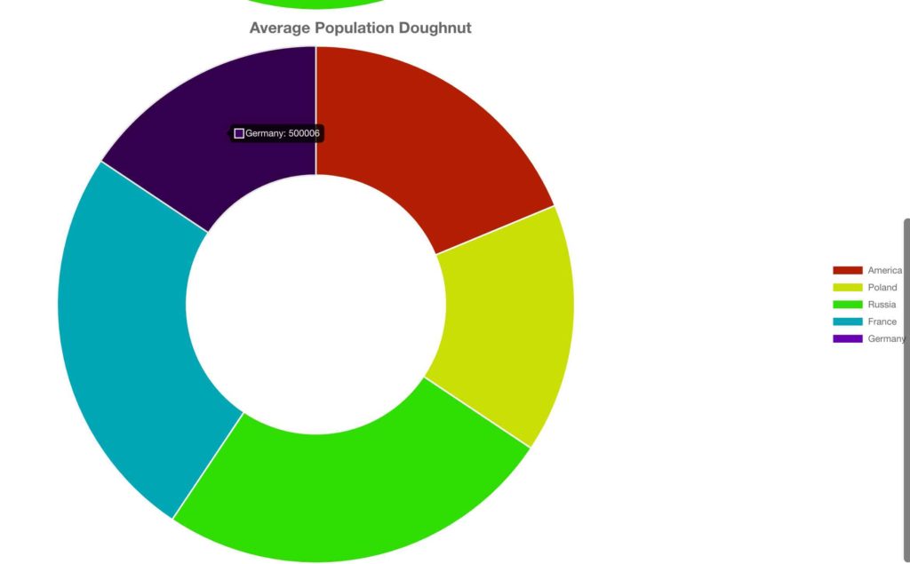
Part 3: Create Pie and Doughnut charts
For creating a Pie and Doughnut charts first, we will need to create a file (PieDoughnut.js) in the component folder.
import React, {useState, useEffect} from 'react';
import { Pie, Doughnut} from 'react-chartjs-2';

function PieChart() {

    const [data, setData] = useState({});

    useEffect(() => {
        setData({
            labels: ['America', 'Poland', 'Russia',
                     'France', 'Germany'],
            datasets: [
              {
                label: 'Average Population',
                backgroundColor: [
                  '#B21F00',
                  '#C9DE00',
                  '#2FDE00',
                  '#00A6B4',
                  '#6800B4'
                ],
                hoverBackgroundColor: [
                '#501800',
                '#4B5000',
                '#175000',
                '#003350',
                '#35014F'
                ],
                data: [600005, 500009, 800000, 800001, 500006]
              }
            ]
          });
    }, [])

    return (
        <div>
            <Pie
          data={data}
          options={{
            title:{
              display:true,
              text:'Average Population PIE Chart',
              fontSize:20
            },
            legend:{
              display:true,
              position:'right'
            }
          }}
        />

        <Doughnut
          data={data}
          options={{
            title:{
              display:true,
              text:'Average Population Doughnut',
              fontSize:20
            },
            legend:{
              display:true,
              position:'right'
            }
          }}
        />
        </div>
    )
}

export default PieChart;
- The first step will be similar to the Line graph. We need to import the necessary utility.
- We need to provide the default data set to display the Pie and doughnut graph chart in this step. Here we are going to display two chart Pie and doughnut with the same value.

- The first step will be similar to the Line graph. We need to import the necessary utility.
- We need to provide the default data set to display the Pie and doughnut graph chart in this step. Here we are going to display two chart Pie and doughnut with the same value.
Part 4: Grouped Bar Chart
The group bar charts are Bar charts in which multiple sets of the same data items are compared. For example rain last and this year. We can denote different colors to be specific. We can use both horizontal and vertical bar charts. For creating a group bar chart first, we will need to create a file (GroupChart.js) in the components folder.
import React, {useState, useEffect} from 'react';
import { Bar } from 'react-chartjs-2';

function GroupChart() {

    const [data, setData] = useState({});

    useEffect(() => {
        setData({
            labels: ['1', '2', '3', '4', '5', '6'],
            datasets: [
              {
                label: '# of Red Votes',
                data: [12, 19, 3, 5, 2, 3],
                backgroundColor: 'rgb(255, 99, 132)',
              },
              {
                label: '# of Blue Votes',
                data: [2, 3, 20, 5, 1, 4],
                backgroundColor: 'rgb(54, 162, 235)',
              },
              {
                label: '# of Green Votes',
                data: [3, 10, 13, 15, 22, 30],
                backgroundColor: 'rgb(75, 192, 192)',
              },
            ],
          });
    }, []);

    const options = {
        scales: {
          yAxes: [
            {
              ticks: {
                beginAtZero: true,
              },
            },
          ],
        },
      }


    return (
    <>
        <div className='header'>
        <h1 className='title'>Grouped Bar Chart</h1>
        </div>
        <Bar data={data} options={options} />
  </>
    )
}

export default GroupChart;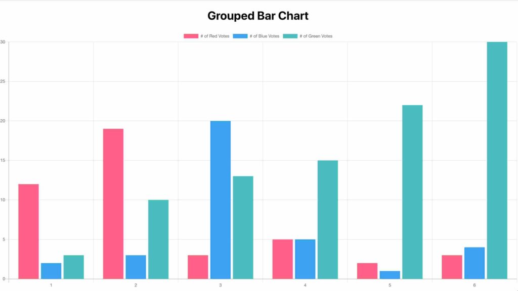
- In the first step, we will import the necessarily react module.
- After that, we will create a variable and set method by using reactjs useState hooks. In useEffect reactjs hook, we will load the data when the component is loaded. In this, we are going to display the difference between the three different sets.
Part 5: Stacked Bar Chart
A stacked bar graph extends the standard bar chart. It shows the comparisons between two or more categories. It divides the chart and compares the whole part. Each bar in the graph represents a fundamental full part.
import React, {useState, useEffect} from 'react';
import { Bar } from 'react-chartjs-2'

function StackedBar() {

    const [data, setData] = useState({});

    useEffect(() => {
        setData({
            labels: ['1', '2', '3', '4', '5', '6'],
            datasets: [
              {
                label: '# of Red Votes',
                data: [12, 19, 3, 5, 2, 3],
                backgroundColor: 'rgb(255, 99, 132)',
              },
              {
                label: '# of Blue Votes',
                data: [2, 3, 20, 5, 1, 4],
                backgroundColor: 'rgb(54, 162, 235)',
              },
              {
                label: '# of Green Votes',
                data: [3, 10, 13, 15, 22, 30],
                backgroundColor: 'rgb(75, 192, 192)',
              },
            ],
          });
    }, []);

    const options = {
          scales: {
            yAxes: [
              {
                stacked: true,
                ticks: {
                  beginAtZero: true,
                },
              },
            ],
            xAxes: [
              {
                stacked: true,
              },
            ],
          },
        };


    return (
    <>
        <div className='header'>
        <h1 className='title'>Stacked Bar Chart</h1>
        </div>
        <Bar data={data} options={options} />
  </>
    )
}

export default StackedBar;
Part 6: MultiType Chart
Multi-chart its allow us to plot data for multiple datasets into one graph. For example, plot the revenue collected each month for the last two years. It plots the high and low of multiple datasets while comparing the datasets.
import React, {useState, useEffect} from 'react';
import { Bar } from 'react-chartjs-2';

function MultiType() {

    const rand = () => Math.round(Math.random() * 20 - 10)

    const [data, setData] = useState({});

    useEffect(() => {
        setData({
            labels: ['January', 'February', 'March', 'April', 'May', 'June', 'July'],
            datasets: [
              {
                type: 'line',
                label: 'Dataset 1',
                borderColor: 'rgb(54, 162, 235)',
                borderWidth: 2,
                fill: false,
                data: [rand(), rand(), rand(), rand(), rand(), rand()],
              },
              {
                type: 'bar',
                label: 'Dataset 2',
                backgroundColor: 'rgb(255, 99, 132)',
                data: [rand(), rand(), rand(), rand(), rand(), rand(), rand()],
                borderColor: 'white',
                borderWidth: 2,
              },
              {
                type: 'bar',
                label: 'Dataset 3',
                backgroundColor: 'rgb(75, 192, 192)',
                data: [rand(), rand(), rand(), rand(), rand(), rand(), rand()],
              },
            ],
          });
    }, []);


    return (
        <div>
            <div className='header'>
            <h1 className='title'>Multi Type Chart</h1>
            </div>
            <Bar data={data} />
        </div>
    )
}

export default MultiType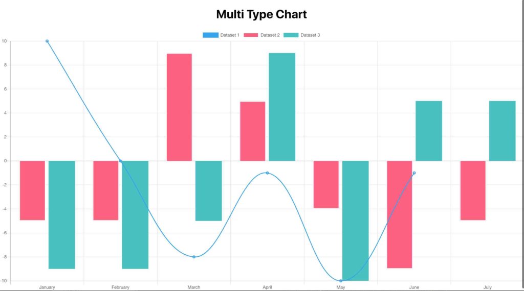
Part 7: Root file of the Application (app.js)
It is the main root file for the application. In this, we will import all our components. I have just added one by one all the pieces(components). We can do styling than it will look better.
import React from 'react';
import './App.css';
import BarChart from './components/BarChart';
import LineGraph from './components/LineGraph';
import PieChart from './components/PieChart';
import GroupChart from './components/GroupChart';
import StackedBar from './components/StackedBar';
import MultiType from './components/MultiType';

function App() {
  return (
    <div className="App">
        <BarChart />
        <PieChart />
        <GroupChart />
        <StackedBar />
        <MultiType />
        <LineGraph />
    </div>
  );
}

export default App;
To run the application run this command
npm startConclusion
In this tutorial, we have tried to use the reactjs-chart to draw the simple bar charts. Thanks for the reading. Please give your feedback so that we can improve our tutorial.
But wanna comment on few general things, The website pattern is perfect, the content is real superb : D. Billi Nap Dumm
Thanks fo the reply hope you like the tutorial.
Im searching on the web trying to find just how to begin this blog site thing as well as your website is nearly certainly really impressive. Farica Morley Micki